1. Take care of your gold. Chances are that your nonprofit received a larger-than-normal number of gifts last month, and many of them came from new donors. The money that came in will help you do your important work, but the gold I’m talking about is the information that came with each gift. You’ve just started a relationship with someone new that you hope will last a lifetime, right? Here are a few things that your organization should pay attention to:
A peek at Helen’s journal – the best of 2013
Do you keep an archive of the best things you’ve found lately? How do you keep track of them? I was thinking about that this morning as I drank a little more of my tea and added another two articles to what I call my journal. How do other folks do this? I wondered. What do they keep? How do they keep it?
Here’s what I do: once every few days or so I’ll gather the best of the articles (or websites or apps or white papers or whatever) that I’ve found and put them into a running archive in Excel. This “journal” is a complete train wreck of every type of thing…all good things that I don’t want to lose track of. Some of it is new in the world, some of it is just new to me. I have tags for easy searching and indexing, and I add a short description so that I’ll remember what I liked about the resource.
Since I’d love to see what you gather, I thought I’d get the ball rolling by showing you what I’ve found in the past year. Here are some of my favorites – from the useful, the interesting, or the just plain fun. Thanks for reading, and for sharing!
Blogs
New to me this year is John Battelle’s searchblog (http://battellemedia.com/). I’m trying to dig out from under the rock I’ve clearly been living under to get caught up with his archived posts. Research, business intelligence and techno-geeks will love Battelle’s finger-on-the-pulse view of search engines, technology, Big Data, and the host of other things he riffs on. John’s also on Twitter at @johnbattelle.
Resources/Websites
Idealware is a 501(c)(3) nonprofit that provides “thoroughly researched, impartial and accessible resources about software to help nonprofits make smart software decisions.” They have free webinars and articles on a variety of topics and tons of articles including “The Nonprofit Social Media Decision Guide” and “A Consumers Guide To Grants Management Systems.” Check them out at http://idealware.org. Especially handy for the small nonprofit head who doesn’t have time to research the best tools but needs good, impartial advice.
Mention – an alternative to Google alerts, Mention has both a free and fee-based service that checks news, social media and the web for your key search words. Highly recommended – we use it ourselves at HBG. https://en.mention.net/
The HBG Prospect Research Links page is new this year. My team put together our favorite prospect research resources for us to use as a group. When we realized others would probably like to use it too, we made it public. So here it is – another free resource from HBG: http://www.startme.com/page/50281/hbg-prospect-research-links
StartMe is my new home page on the web. I researched replacements for the keenly lamented iGoogle (which Google axed this year), and thought I’d never find something I liked as well. Boy, was I wrong – I like StartMe even more. Here’s why: Flexibility and customize-ability. I created a main page with links of all of the sites I go to most frequently. Then I made several tabs with pages for each of my interest areas (like fundraiser’s/researcher’s blogs, general resources, news feeds, alerts, food writers’ blogs that I follow, etc.) that I can add to at any time. You can set up RSS feeds, get news headlines, create a page of links (like we did for the HBG research links page)…the list really goes on and on. Pages can be public or private which is another really nice feature. And it’s free!
Books
I’d be crazy if I didn’t mention the book that I wrote with Jennifer Filla called Prospect Research for Fundraisers; the essential handbook that came out last year. Published by John Wiley & Sons as part of the Association of Fundraising Professionals (AFP) Donor Series, our book covers everything frontline fundraisers and chief development officers need to know about research, relationship management and analytics (without getting too far into the nitty gritty). Click here to take a look at it and to read our five-star reviews. Critics say “A gem in its clarity” and “Filla and Brown’s [book] will transform the way you think about prospect research.”
New this fall and definitely worth reading: The Chief Development Officer; beyond fundraising, by Ronald J. Schiller. For fundraisers thinking about the corner office or for those who have already attained it, this book contains case studies, interviews and advice from scores of trustees, presidents and CDOs. Click here to take a look or to buy this easy-to-read volume. A talented CDO I know read it on a flight from Miami to Heathrow and sent out a note on landing to his coffee klatch of colleagues recommending they hurry out and buy it!
Just for Fun
Fundraiser Grrl – she’s just a hoot. I visit this blog when I need a quick hit of fundraising humor. Latest gif: “Trying to get my boss’s attention when we need to leave for a donor meeting” featuring a gif of …well, you’ve just got to see it.
And speaking of funny, check out Nonprofit Humour. It’s a website with articles and timely “news” designed to give nonprofiteers a chuckle. For example, the latest article is “Santa Claus gets poor rating from Charity Watchdog.” Ha!
Newsletters
Netted by the Webbys: I’ll confess, Netted isn’t actually new to me this year, but I like it so much I wanted to mention it anyway. Their daily email zap comes with just one short description of an app, website, product or tool that I will often either use myself or forward along to someone I know who will use it. Subscribing to Netted makes me feel like I have access to a connected group of hipsters at the cutting edge of tech sending me the hottest tools I need to know about.
And you already know about ResearchBuzz, right? If not, get over there this minute! I’ve been following Tara Calishain’s newsletter / blog-style online goldmine that tracks search engines, databases and online information collections since the mid-1990s, and even though it’s not new to me it should be on my best-of list every year. Get it on RSS feed so you don’t miss anything.
White Papers
Right on the Money: How to keep the doors of your nonprofit organization open in good times and bad, published by the Alabama Association of Nonprofits. It’s a well-written, powerful resource on sustainability with lots of good advice from industry experts. [spoiler alert – I was one of the interviewees.]
The Evolving Value of Information Management and the five essential attributes of the modern information professional. This is a must-read for researchers. (Which is not to say that others wouldn’t find it useful as well, but really, this white paper was written by researchers for researchers, and if you are one, you really should make the time). A collaboration of the Financial Times and the Special Libraries Association. Get it at http://ftcorporate.ft.com/files/2013/10/FT-SLA-Report.pdf
The “Predicting The Future” white paper series from the IBM developerWorks lab fascinated me this year. If you’re interested in predictive analytics, this series is for you. Find it at http://www.ibm.com/developerworks/library/ba-predictive-analytics1/index.html. Geek out.
So that’s it – some of my favorite new resources discovered in the last year. What have you found? If you find something useful, chances are that others will too. Thanks, and here’s to more great discoveries in 2014!
Google Alerts: what’s going on
Several people have asked me lately about the demise of Google Alerts so here’s a little background for you as well as links to selected resources for more information and better results.
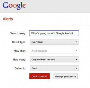
In case you’ve never used Google Alerts, here’s what they are: Google has a page where you can set an alert on a search string to automatically run the search and have results sent to you on a schedule of your choosing. Until recently, this notification could come by email OR via a very handy direct pipeline called an RSS feed to a free Google Reader account.
THE BEGINNING OF THE PROBLEM
Unfortunately, and to a great deal of hue and cry, this past July Google pulled the plug on Google Reader and on the ability for users to receive Google Alerts via an RSS feed. Alerts could only be received via email.
Coupled with all of this was evidence that Google Alerts were not working as well as they had been in the past. Noted search engine expert Danny Sullivan reported that his alerts were significantly reduced and he wondered (as many others did) if this signaled the demise of Google Alerts as well.
However, in September of this year it was reported by a few who noticed that Google Alerts were again available via RSS feed – not that Google made a splashy big deal of it. Quite the contrary.
SO WHAT’S THE DEAL?
We really don’t know if Google Alerts are going away, or if they are going to remain but be unsupported, or if they will eventually be phased out like Reader. It certainly appears to experts that alerts are not being supported by Google now as they were in the past. Notifications are now available again as RSS feeds, but that is small consolation if the information you receive is sparse compared to the amount of information that is truly available within the search engine’s database.
ARE THERE ALTERNATIVES?
We certainly haven’t stopped using Google Alerts here at HBG, but we are using alternatives, both free and fee-based. Two of them are Lexis Nexis and Mention, but there are many for you to choose from. My feeling is: even if Google Alerts give good results, there’s no harm in being sure you’re getting the full scope of what’s available within your budget.
Are you using Google Alerts or an alternative (or both?). Do you have recommendations?
Reading list: (articles in order of appearance in post)
Warren, Christina – Mashable: Are Google Alerts Dying? 22 March 2013
Sullivan, Danny – Search Engine Land: Dear Google Alerts: Why Aren’t You Working? 15 February 2013
Protalinski, Emil – The Next Web: Google Alerts regains RSS delivery option it lost after Google Reader’s demise. 11 September 2013
Dembak, Yoav – VB Social: 7 Apps to Help You Replace Google Alerts. 13 May 2013
Fundraising Analytics ABCs – Visualizing Data
What are the best representations of information that you’ve ever seen? For most people, they’re the ones that are the simplest to understand. The ones that display information clearly and move people to action. Or inaction:
Even in a different language, if we understand the context, the message is still clear.
That’s what good data visualization does. It takes information and lays it out in the simplest of terms to get across what needs to be communicated.
KISS
There’s no getting around the fact that data analytics is intimidating for most of us, and that it produces a lot of really interesting factoids that can move people to action. But when you’re trying to get across complex information, there are still ways to keep messaging simple. In fact, the more complex the information, the more imperative it is to KISS (Keep It Simple, Stupid). Or, in the words of Joey Cherdarchuk, director of operations at DarkHorse Analytics, Data Looks Better Naked.
THE MASTER AT WORK
If you haven’t seen Hans Rosling’s fascinating TED Talks using his free software GapMinder or watched his fascinating holographic data visualization on YouTube, you really should take the time to be impressed. And inspired.
Even if you’re not a data analytics person, watching Dr. Rosling will help you think about presenting information better, whether you’re a frontline fundraiser, researcher, social media guru, consultant or …just about anyone. Okay, go watch those two videos and then come back and we’ll talk more about available resources for visualizing data.
RESOURCES
Now that you’re inspired to do something different, let’s talk about what’s available for manipulating and showing off the great conclusions (or continuing questions) that your data is begging you to share.
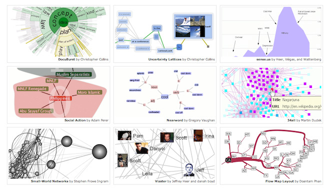
Enter the graph, the moving chart, the GIF, the mini movie, the podcast, and the interactive illustration, to name a few, all made possible by recent entries into the market from companies including (in alpha order) Advizor Solutions, a flexible visualization tool that is especially good for looking at annual giving results and gift officer portfolio performance; Factary, whose product Atom allows you to visualize relationships between people, organizations and entities; Rapid Insight, a modeling and illustration package; and Tableau Software, an interactive visualization tool that allows for on-the-fly graphic shifting and drill-down-into-the-data capability.
What’s free?
NodeXL, which adheres to Excel like an elbow-length glove to allow you to manipulate and visualize relationships and social media interactions. Hans Rosling’s Big Data manipulator, GapMinder, which he uses in the aforementioned videos, is also completely free to download. And there are lots of others.
Where are some examples of visualizations?
Here is a terrific collection of resources from Andy Kirk, a UK-based freelance data visualization design consultant. And Mike Bostock of The New York Times has pulled together a great compilation of compelling visualization tools.
Finally, we’d like to leave you with a quote by David Schmitt, head of Performance Strategy and Planning Analytics in the finance division at the Intercontinental Hotels Group (IHG). Schmitt’s team is responsible for communicating information about IHG’s financial performance in a way that is entertaining, compelling and clear. You wouldn’t think that corporate financials would lend themselves to music videos, but that’s one of the tools Schmitt’s group has used to visualized data. For him, “data isn’t the point; numbers aren’t the point—it’s about the idea.”
It looks like our Excel pie chart days are probably over, thank goodness. We’d love to hear about any tools, resources or sites that you’ve found to help you visualize data, too! Please share them here in Comments, so that all of us can check them out.
Fundraising Analytics ABCs – Donor Modeling
Chances are good if you are in the fundraising field that you have heard the term “fundraising analytics.” You’ve probably also heard the terms “data mining,” “donor modeling,” “reporting” and “prospect identification,” too. Do these terms mean the same thing? What are the differences among them?
I asked Marianne Pelletier, who leads the HBG Analytics team, to help me put together a series of short articles designed to make sense of these terms. In each, she will describe the method and give examples of how they can be used. To continue our series, we describe the questions that Donor Modeling can answer.
Let’s begin with a case study:
A museum is in the planning stage to launch a major fundraising campaign. Their last campaign was over 5 years ago, and while they had a number of significant gifts, the coming campaign will require many more major gifts in order to be successful. After developing a table of gifts for the campaign, it quickly becomes apparent that there are huge gaps that need to be filled with prospects at every level. Significant prospect identification needs to happen.
To score the museum’s database and identify the top prospects, the museum decides to use a technique called predictive modeling, also referred to commonly as donor modeling.
What is donor modeling?
Donor modeling uses statistics tools to score a group of records using a variety of methods, including regression analysis, clustering, decision trees, neural networks and support vector machines (SVMs) amongst lots of others. Let’s take a look at just one of them, regression analysis.
Regression analysis uses calculus to find the slope of a line, which helps us visualize trends in the data. For example, we could see (based on a number of factors) which groups of people in the museum’s database have the most capacity to give as well as affinity, or connection to, the museum.
Here’s a standard matrix that is often built for major gifts programs. After downloading records and using regression analysis to score the group studied, prospects would be shown along the slope of the red line based on their relative affinity with the museum and their capacity to make a major gift.
Affinity, or “how much they love the museum” might be measured by the number of times someone attended events, or donated in consecutive years, or bought tickets to special exhibits, amongst other things. Capacity, or “how much they can give” might be found through primary or secondary research, such as a visit, prospect research or an electronic screening.
A graphic describing the relative level of a group of prospects’ affinity using a number of hearts (ranked on a scale of 1 to 3) and the relative level of their gift capacity (ranked 1 to 3) by dollar signs might look something like this:
In this example, the top-right box represents those with greatest capacity and affinity for the organization, and the bottom-left box shows those with the least.
If you were the chief development officer at the museum, whom would you want to approach first? Your answer is likely to be those in the top right group. Unfortunately most of the time that group is also the smallest population among the scored groups, and are usually the donors you know fairly well.
Whom to select next, then? Often, two of the largest groups, represented by the larger boxes, are the $$$ ♥♥ and the $$♥♥♥ groups. And of those, it might be hard to decide which to choose.
So, your next donor modeling study might be to look at the museum’s past track record with each of these two groups. What is your level of success in cultivating each group? What motivates them to become major gift donors?
Donor modeling helps answer those questions. The characteristics of top level donors are compared to various segments of the pool, and their scores help bubble up the best future prospects.
What else can you use donor modeling for?
Although it’s most often used to identify major gifts prospects, donor modeling can also rank groups like these:
- Annual giving prospects who are most likely to renew
- People who are likely to be good board/volunteer candidates
- Planned giving prospects
- People who would be great prospects for a specific project or campaign (like a library fund, or for endowment)
- People who would be most likely to accept a request for a visit
- Top level annual giving prospects
- Prospects best suited for a particular gift officer or volunteer
Donor modeling can even help determine the best ways to acquire new members for a member recruitment campaign. It’s a powerful tool to help your organization identify new donors, whether you’re in a campaign, thinking about a campaign, or just looking for new donor prospects.
What do you need to know?
Our series on the ABCs of fundraising analytics continues next Thursday, September 19 with a look at data visualization.
Do you have questions about donor modeling or would you like to see it at work at your organization? Contact us at info [at] helenbrowngroup [dot] com for more information.
Fundraising Analytics ABCs – Data Mining
Chances are good if you are in the fundraising field that you have heard the term “fundraising analytics.” You’ve probably also heard the terms “data mining,” “donor modeling,” “reporting” and “prospect identification,” too. Do these terms mean the same thing? What are the differences among them?
I asked Marianne Pelletier, who leads the HBG Analytics team, to help me put together a series of short articles designed to make sense of all of this. In each, we will describe the method and give examples of how they can be used. To begin our series, we discuss data mining.
Let’s begin with a case study:
The fundraising team at a university is having a problem with donor retention. Every year the university must acquire a significant number of new donors to offset the nearly 50% of donors they lose from the previous year. They need to find an answer to the question “why are we losing so many donors, and what can we do to keep them from leaving?”
They decide to use a technique called data mining to find out.
What is data mining?
Sometimes we don’t know what we don’t know. In those situations, it may be best to explore a little to see if we can find answers (and perhaps even see the questions we need to ask). Think of it as discovering what’s in a new mall by walking the length of it: data mining is like shopping in the data mall. What will we find when we look in each store?
Data mining sifts data back and forth until it finds natural breaking points, puts together associated characteristics and then lays out what it finds. For example:
“The donors who give the highest gift amounts are married male alumni. They’re in their 50s. They live along the east or west coast. They have a job and children that we know about.”
Data mining delves deeper to find relationships between many characteristics
The good news is that data mining also names the characteristics for the second best segment, and the third best, and so on, so a university could use it to find out various solutions to their attrition problem. The characteristics they see might look like these:
“The donors who stop donating tend to leave between their 5th and 6th years of consistently donating to the annual fund” So we can work harder to retain them before year 5!
“The donors who stop donating tend to be married alumni males in their thirties” What special incentives can we offer to that group since we know that married men in their 50s tend to be our largest donors later on?
Data mining can also be used for:
- Determining the best solicitation methods for donor acquisition, renewal, or upgrade
- Measuring the characteristics of event attendees who later become donors
- Understanding the clusters of members/grateful patients/families/alumni/docents who respond better to e-mail, direct mail, phone calls, or social media
- Finding the best pattern for the cultivation/giving ladder
- Adding or dropping solicitation methods, or venues
- Assessing timing, including how long it takes to successfully solicit gifts at different levels
What else can data mining do?
Have you ever walked into a store that has section after section of fun things for purchase? A department each of clever t-shirts, gifts that your best friend would love, beautiful hand-crafts, and more – things that are so perfect that you’ve picked up an armful of things and you need to find a basket to dump them all in.
Data mining is like that. It can also be for:
- clustering like-minded, or like-attributed prospects for a cultivation dinner
- breaking long-held “truths” about your donor base, such as “our best athletics prospects are male football alumni.” What if that’s not actually true?
- looking at what statistics calls “interactions” – the combination of characteristics that make good prospects, members, volunteers, trustees, etc. For example: Married prospects and/or prospects living in rural areas show a mild relationship to loyal giving. However, prospects who are married AND live in rural areas show a strong relationship to loyal giving.
- determining which group responds best to email and which to social media.
What do you want to know?
Our series continues next Thursday, September 12 when we will discuss Donor Modeling.
Do you have questions about data mining or would you like to see how it can work for your organization? Email us for more information at info [at] helenbrowngroup [dot] com.
What if fundraisers reported to the Director of Strategic Information?
Are you hearing a lot of talk lately that fundraising is becoming more data-driven? That we need to show the return on investment of donor dollars? We’re all hearing this train coming down the track and it’s fueled by top volunteers who are used to seeing that kind of business intelligence in their company board meetings. In the past few years they’ve come to expect to see it when they sit at the nonprofit board table as well.
It’s good business, and it makes sense
We all want to cultivate prospects that have the highest likelihood to become donors. And we need to be careful with our most valuable resources – time and money. So it makes sense that business intelligence methods are edging into fundraising work as well. Ten years ago, we didn’t hear much about analytics in fundraising, but in the past five years more and more shops are hiring fundraising analysts – internally or outsourcing the activity to companies like mine.
Earlier this month, Forbes magazine published an article called “Does Your Organization Need a Chief Analytics Officer?” (link here). The article describes two very interesting case studies highlighting how Caesars Entertainment and KeyBank are using analytics to create stronger relationships with their customers and creating more revenue.
Ruben Sigala, the new CAO of Caesars:
“The data we collect is a treasure trove that enables us to treat every guest well, but treat every guest differently,” says Sigala. “And centralizing the function has enabled us to get a lot more creative about how to reward customers across properties and functions, and how to drive more revenue for Caesars.”
By substituting a few words, it’s easy to see how that could translate to fundraising, isn’t it?
At Cleveland-based KeyBank, one of the top 20 largest banks in the country, they’ve done something really interesting: the marketing team and the analytics team both report to the Chief Analytics Officer. What would that look like translated to fundraising? Major gifts officers would report to the Director of Strategic Information.
Will that happen in your shop? I’m sure the marketing folks at KeyBank wouldn’t have thought it possible 10 years ago.
Regardless, the big takeaway here is that fundraising analytics is here to stay. These tools are incredibly nimble and powerful and are having a tremendous impact on the organizations – large and small, for-profit and nonprofit – that are using it. And if you are unfamiliar with the terms or how data analytics can help you, stay tuned to this space.
Over the next few blog posts, HBG’s chief analytics consultant Marianne Pelletier and I will go over, in English, what analytics are and what these tools can do for you and your organization. If you have any questions at all, or are interested to see how we can help, don’t hesitate to be in touch.
First in the series, this Thursday we’ll discuss Data Mining.
Research Magic
I think it’s easy to get frustrated with assumptions that some front-line fundraisers have about prospect research. On the one hand, we researchers want people to see us as a resource. Indispensable. That we have (or can get) all the answers. Fast.
As a personality type, we tend to be diligent and dogged sorts of people – we generally can’t rest until we find the answer. We learn Boolean logic. We use databases that give us reliable answers. We get faster at it and we’re proud of our agility and reliability.
But that can foster an assumption that research profiles just appear (poof!) with the push of a button. Or that full profiles only take a couple of hours to do.
As a colleague at the APRA conference said two weeks ago, “Research profiles take two hours to do just like a major gift takes 18 months to get.”
They have no idea what we do all day…
A few months ago I did a training session – an introduction to prospect research – for a development team at a mid-sized nonprofit that had no researcher. I asked them to give me the name of one of their donors that they’d recently researched using the big search engine. They were feeling pretty confident that it had turned up everything there was to find about their Mr. Smith.
So first I used that search engine (and taught them about a couple of others) and we went through the results. Then I pulled out my research magic wand.
I admit, I just love the ooohs and the aaahs that always generates. Then I showed them a few other fee-based resources we use. Deep web, pay-wall, give-me-the-serious-411 kinds of resources.
“Wow, that’s a lot of information. It must take you forever to visit all these sites and pull together a profile on someone” said the director of major gifts.
…and we have no idea what they do.
But before we researchers start feeling too smug here, let me just say that we make a lot of assumptions, too, about what fundraisers do all day. The good ones make it look easy – but it’s a lot of hard work and it takes longer than we think.
So here’s my proposal: The next time your development office does a brown bag lunch together, show each other what you do. Just a half-hour each. Talk about how much time each thing that you do takes and what your greatest joys and frustrations are.
Honestly, it’ll just be…magic!
The true test of research
“The true test of research is whether people use it – for reference, for influence, and most importantly, for change.” *
We all want our work to mean something, don’t we? It just kills us when research (or screenings, or any information, really) just sits on a shelf unread. Unused. All that work – all that potential – just…going nowhere.
In order for it to be a force for change, our research has to grab hold of people and inspire them to take action with it. How do you do that?
Is your research being used?
How do you know for sure? Have you talked with your end users in the past 6 months? Are reports being delivered in a format that is helpful or would a different deliverable be better (fit for iPad, or in a podcast?). Do they contain the right amount of information? The right information? If so, have you shared your success stories with peers in the profession? What’s business-as-usual for one could be innovation to another.
Is your research creating change?
How do you know for sure? Are you measuring its impact? Maybe it’s making more of a difference than you think. Or maybe by tweaking your resources, your training, or your delivery methods a little bit you can deliver significant improvement. What metrics can you use to track and discover your success and gaps?
Your research and the critical information it delivers can create change.
How do you want to be part of that change?
*DFID website, several months ago. Sadly the quote is no longer there but they’ve got other great ones, as well as really interesting research studies.
More than just prospect research
Next month, members of the Association of Professional Researchers for Advancement (APRA) will gather in Baltimore, MD for the association’s annual conference. If you know someone who is thinking about a career in prospect research or are a supervisor with a staff member who needs training, this really is the conference for them to attend. Topics will range from basics training for new researchers to in-depth training on fundraising analytics and everything in between.
Throughout the rest of the year, many APRA chapters offer excellent continuing education, including networking events, brown bags, and conferences. Both APRA and many of its chapters also have monthly or quarterly newsletters as well.
BUT…in addition to APRA, there are a variety of allied professional associations that are highly relevant to prospect research, and reading their newsletters and blogs, and following the associations or members on social media can be a great way to enhance a researcher’s knowledge. They include:
- the Association of Advancement Service Professionals (AASP)
- the Association of Independent Information Professionals (AIIP)
- Strategic and Competitive Intelligence Professionals (SCIP)
- Special Libraries Association (SLA) – Information Outlook, their association’s bi-monthly newsletter is available free at their website.
Finally, besides the newspapers and magazines that we may subscribe to keep up on business and industries there are also several journals, websites and blogs that provide insight about the craft of information discovery and searching. They include:
What resources do you follow to stay up on the craft of research? Share!!
- « Previous Page
- 1
- …
- 22
- 23
- 24
- 25
- 26
- 27
- Next Page »